In Part I of this short course you will:
- Find out
about the need for JavaTM
Foundation Classes (JFC)-Swing and its advantages over the
Abstract Window Toolkit (AWT)
- Learn about
the JFC-Swing Controls
- Learn about
the JFC-Swing Layout Managers
Course Outline
Sun Microsystems is leveraging the technology of NetscapeTM Communications, IBM, and Lighthouse
Design (now owned by Sun) to create a set of Graphical User
Interface (GUI) classes that integrate with JDKTM 1.1.5+, are standard with the Java ® 2
platform and provide a more polished look and feel than the standard
AWT component set. The collection of APIs coming out of this effort,
called the Java Foundation Classes (JFC), allows developers to build
full-featured enterprise-ready applications.
JFC is composed of five APIs: AWT, JavaTM 2D, Accessibility, Drag and Drop, and
Swing. The AWT components refer to the AWT as it exists in JDK
versions 1.1.2 and later. Java 2D is a graphics API based on
technology licensed from IBM/Taligent. It is currently available
with the Java® 2 Platform (and not usable with JDK 1.1). The
Accessibility API provides assistive technologies, like screen
magnifiers, for use with the various pieces of JFC. Drag and Drop
support is part of the next JavaBeanTM generation, "Glasgow," and is also
available with the Java® 2 platform.
Swing includes a component set that is targeted at forms-based
applications. Loosely based on Netscape's acclaimed Internet
Foundation Classes (IFC), the Swing components have had the most
immediate impact on Java development. They provide a set of
well-groomed widgets and a framework to specify how GUIs are
visually presented, independent of platform. At the time this was
written, the Swing release is at 1.1 (FCS).
Though the Swing widgets were based heavily on IFC, the two APIs
bear little resemblance to one another from the perspective of a
developer. The look and feel of some Swing widgets and their
rendering is primarily what descended from IFC, although you may
notice some other commonalties.
The AWT 1.1 widgets and event model are still present for the
Swing widgets. However, the 1.0 event model does not work with Swing
widgets. The Swing widgets simply extend AWT by adding a new set of
components, the JComponents, and a group of related support
classes. As with AWT, Swing components are all JavaBeans and
participate in the JavaBeans event model.
A subset of Swing widgets is analogous to the basic AWT widgets.
In some cases, the Swing versions are simply lightweight components,
rather than peer-based components. The lightweight component
architecture was introduced in AWT 1.1. It allows components to
exist without native operating system widgets. Instead, they
participate in the Model/View/Controller (MVC) architecture, which
will be described in Part II of this course. Swing also contains
some new widgets such as trees, tabbed panes, and splitter panes
that will greatly improve the look and functionality of GUIs.
Swing can expand and simplify your development of cross-platform
applications. The Swing collection consists of seventeen packages,
each of which has its own distinct purpose. As you'll learn in this
short course, these packages make it relatively easy for you to put
together a variety of applications that have a high degree of
sophistication and user friendliness.
javax.swing
- The high
level swing package primarily consists of components, adapters,
default component models, and interfaces for all the delegates and
models.
javax.swing.border
- The border
package declares the
Border interface and classes,
which define specific border rendering styles.
javax.swing.colorchooser
- The
colorchooser package contains support classes for the color
chooser component.
javax.swing.event
- The event
package is for the Swing-specific event types and listeners. In
addition to the
java.awt.event types, Swing
components can generate their own event types.
javax.swing.filechooser
- The
filechooser package contains support classes for the file chooser
component.
javax.swing.plaf.*
- The
pluggable look-and-feel (PLAF) packages contain the User Interface
(UI) classes (delegates) which implement the different
look-and-feel aspects for Swing components. There are also PLAF
packages under the
javax.swing.plaf hierarchy.
javax.swing.table
- The table
package contains the support interfaces and classes the Swing
table component.
javax.swing.text
- The text
package contains the support classes for the Swing document
framework.
javax.swing.text.html.*
- The
text.html package contains the support classes for an HTML version
3.2 renderer and parser.
javax.swing.text.rtf
- The
text.rtf package contains the support classes for a basic Rich
Text Format (RTF) renderer.
javax.swing.tree
- The tree
package contains the interfaces and classes which support the
Swing tree component.
javax.swing.undo
- The undo
package provides the support classes for implementing undo/redo
capabilities in a GUI.
javax.accessibility
- The JFC
Accessibility package is included with the Swing classes. However,
its usage is not discussed here.
This section describes how to use the various Swing widgets. The
Swing component hierarchy is shown in two parts for comparison with
AWT. Part 1 of the component hierarchy is similar to that of AWT.
However, there are over twice as many components in Swing as in AWT.
Part 2 shows the expanded Swing component set. This group of
components appeals most to developers, as it provides a much richer
set of widgets to use.
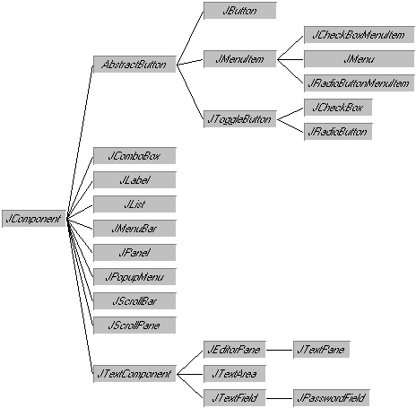
Component Hierarchy: Part 1--AWT Similar
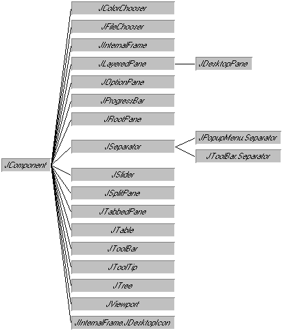
Component Hierarchy: Part 2--New And Expanded Components
The first widget to discuss is JPanel. It is a
lightweight Panel object offering built-in support for
double buffering. When buffering is enabled, through the
constructor, all the drawing operations of components within the
panel will be drawn to an off-screen drawing area prior to being
drawn to the screen. The JPanel class is used in most
of the examples in this section.
The second component, Icon, isn't really a component
at all. However, you can use it with almost all Swing
components.
An Icon is used to describe fixed-size pictures, or
glyphs. Typically, you embed icons in a JButton or
other JComponent. Objects that can act as icons
implement the Icon interface, shown below. It contains
a paintIcon() method that specifies a drawing origin.
You render the picture specified in the paintIcon()
method in a rectangle whose size cannot exceed a rectangle with an
origin at (x, y), a width of
getIconWidth(), and a height of
getIconHeight(). The Component parameter
to paintIcon() is not usually used, unless you need to
specify additional information, such as a font or color.
public interface Icon {
  void paintIcon(
    Component c, Graphics g, int x, int y);
  int getIconWidth();
  int getIconHeight();
}
The ImageIcon class is an implementation of
Icon that creates an Icon from an
Image.
Icon tinyPicture = new ImageIcon("TinyPicture.gif");
Alternatively, the ImageIcon constructor can take an
Image or URL object or byte array as its
parameter, with an optional String description
parameter. One nice thing about ImageIcon is it checks
a cache before retrieving the image file.
Swing uses ImageIcon rather than Image
for two reasons:
- An
Image loads asynchronously, creating the need to
monitor the loading process (with
MediaTracker).
- An
Image is not serializable.
In addition to using ImageIcon, you can implement
the interface yourself to create your own icons:
public class RedOval implements Icon {
  public void paintIcon (Component c, Graphics g,
                         int x, int y) {
    g.setColor(Color.red);
    g.drawOval (x, y, getIconWidth(), getIconHeight());
  }
  public int getIconWidth() {
    return 10;
  }
  public int getIconHeight() {
    return 10;
  }
}
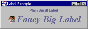
A JLabel is a single line label similar to
java.awt.Label. Additional functionality that a
JLabel has is the ability to:
- Add an
Icon
- Set the
vertical and horizontal position of text relative to the
Icon
- Set the
relative position of contents within component
public class LabelPanel extends JPanel {
  public LabelPanel() {
    // Create and add a JLabel
    JLabel plainLabel = new JLabel("Plain Small Label");
    add(plainLabel);
    // Create a 2nd JLabel
    JLabel fancyLabel = new JLabel("Fancy Big Label");
    // Instantiate a Font object to use for the label
    Font fancyFont =
      new Font("Serif", Font.BOLD | Font.ITALIC, 32);
    // Associate the font with the label
    fancyLabel.setFont(fancyFont);
    // Create an Icon
    Icon tigerIcon = new ImageIcon("SmallTiger.gif");
    // Place the Icon in the label
    fancyLabel.setIcon(tigerIcon);
    // Align the text to the right of the Icon
    fancyLabel.setHorizontalAlignment(JLabel.RIGHT);
    // Add to panel
    add(fancyLabel);
  }
}
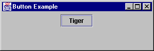
A JButton can be instantiated and used in a GUI just
like a java.awt.Button. It behaves like an AWT 1.1
Button, notifying ActionListener list
elements when pushed.
public class ButtonPanel extends JPanel {
  public ButtonPanel () {
    JButton myButton = new JButton("Tiger");
    add(myButton);
  }
}
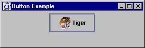
Also, the JButton has support for an embedded
Icon, specified in the constructor, or via the
setIcon() method. This creates an image button; here,
with the label Tiger:
public class ButtonPanel extends JPanel {
  public ButtonPanel() {
    Icon tigerIcon = new ImageIcon("SmallTiger.gif");
    JButton myButton = new JButton("Tiger", tigerIcon);
    add(myButton);
  }
}
Magercises
- Installing
Swing and SwingSet Demonstration
- Creating
Your First JFC Application
- Creating
Buttons With Icons
While the AbstractButton isn't a class you use
directly, several of the more common JComponent classes
inherit much of their shared behavior from this object. For
instance, the icon usage methods getIcon() and
setIcon() come from AbstractButton. (The
methods are also available elsewhere.) Some of the other common
features are listed below:
setMnemonic()
- Add a keyboard accelerator to a text label, use the
VK_* constants from KeyEvent to specify
the key
doClick()
- Programmatically, select the button
setDisabledIcon(),
setDisabledSelectedIcon(),
setPressedIcon(), setRolloverIcon(),
setRolloverSelectedIcon(),
setSelectedIcon() - Change the displayed
Icon, based on the button state (in addition to
setIcon())
setVerticalAlignment(),
setHorizontalAlignemnt() - Anchors icon/text in
different areas of button
setVerticalTextPosition(),
setHorizontalTextPosition() - Positions text in
different areas around icon. Both
setXXXAlignment() and
setYYYTextPosition() rely on the
SwingConstants interface for the area placement
settings.
Note: The upcoming Swing 1.1.1 release includes
the ability to specify label text in HTML by preceding the content
with <html>. This will allow you to have multi-line button
labels without having to customize the user interface.
A JCheckBox is similar to an AWT
Checkbox that is not in a CheckboxGroup.
Although Swing provides a default graphic to signify
JCheckBox selection, you also can specify your own
Icon objects for both the checked and unchecked state.
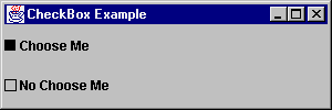
public class CheckboxPanel extends JPanel {

  Icon unchecked = new ToggleIcon (false);
  Icon checked = new ToggleIcon (true);

  public CheckboxPanel() {

    // Set the layout for the JPanel
    setLayout(new GridLayout(2, 1));
    // Create checkbox with its state
    //  initialized to true
    JCheckBox cb1 = new JCheckBox("Choose Me", true);
    cb1.setIcon(unchecked);
    cb1.setSelectedIcon(checked);
    // Create checkbox with its state
    // initialized to false
    JCheckBox cb2 = new JCheckBox(
      "No Choose Me", false);
    cb2.setIcon(unchecked);
    cb2.setSelectedIcon(checked);
    add(cb1);
    add(cb2);
  }
  class ToggleIcon implements Icon {
    boolean state;
    public ToggleIcon (boolean s) {
      state = s;
    }
    public void paintIcon (Component c, Graphics g,
                           int x, int y) {
      int width = getIconWidth();
      int height = getIconHeight();
      g.setColor (Color.black);
      if (state)
        g.fillRect (x, y, width, height);
      else
        g.drawRect (x, y, width, height);
    }
    public int getIconWidth() {
      return 10;
    }
    public int getIconHeight() {
      return 10;
    }
  }
}
In AWT, radio buttons are checkboxes that belong to the same
CheckboxGroup; which ensures that only one checkbox is
selected at a time. Swing has a separate widget called a
JRadioButton. Each JRadioButton is added
to a ButtonGroup so the group behaves as a set of radio
buttons. Like CheckboxGroup, ButtonGroup
is a functional object that has no visual representation.
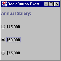
public class RadioButtonPanel extends JPanel {

  public RadioButtonPanel() {
    // Set the layout to a GridLayout
    setLayout(new GridLayout(4,1));

    // Declare a radio button
    JRadioButton radioButton;

    // Instantiate a ButtonGroup for functional
    // association among radio buttons
    ButtonGroup rbg = new ButtonGroup();

    // Create a label for the group
    JLabel label = new JLabel("Annual Salary: ");
    label.setFont(new Font(
      "SansSerif", Font.BOLD, 14));
    add(label);

    // Add a new radio button to the pane
    radioButton = new JRadioButton("$45,000");
    add (radioButton);
    // set key accelerator
    radioButton.setMnemonic (KeyEvent.VK_4);

    // Add the button to the ButtonGroup
    rbg.add (radioButton);

    // Set this radio button to be the default
    radioButton.setSelected(true);

    // Set up two more radio buttons
    radioButton = new JRadioButton("$60,000");
    radioButton.setMnemonic (KeyEvent.VK_6);
    add (radioButton);
    rbg.add (radioButton);
    radioButton = new JRadioButton("$75,000");
    radioButton.setMnemonic (KeyEvent.VK_7);
    add (radioButton);
    rbg.add (radioButton);
  }
}
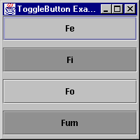
Technically speaking, you can add JCheckBox or
JToggleButton (described next) components to a
CheckboxGroup. At most, one will be selected while in
the group.
The JToggleButton class is the parent to both
JCheckBox and JRadioButton. It doesn't
have an AWT equivalent. The JToggleButton works like a
Button that stays pressed in when toggled on. When a
JToggleButton is toggled off, you cannot tell it from a
regular Button or JButton class.
public class ToggleButtonPanel extends JPanel {
  public ToggleButtonPanel() {
    // Set the layout to a GridLayout
    setLayout(new GridLayout(4,1, 10, 10));
    add (new JToggleButton ("Fe"));
    add (new JToggleButton ("Fi"));
    add (new JToggleButton ("Fo"));
    add (new JToggleButton ("Fum"));
  }
}
Like the AWT 1.1 ScrollPane,
JScrollPane handles automatic horizontal and vertical
scrolling of content. It lays out components using a
ScrollPaneLayout, described in more detail under Swing
Layouts. The key thing to know when using a
JScrollPane is that Swing provides a
JViewport for adding the object to scroll.
To get a handle to the viewport, JScrollPane has a
getViewport() method. Then, to add a component to the
viewport, the JViewport class has an add
method.
JViewport vport = someScrollPane.getViewport();
vport.add(someComponent);
Or, more commonly, the two lines are combined:
someScrollPane.getViewport().add(someComponent);
Another option is to provide the component to scroll to the
constructor:
JScrollPane pane = new JScrollPane(someComponent);
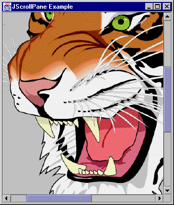
public class ScrollPanel extends JPanel {

  public ScrollPanel() {
    setLayout(new BorderLayout());
    Icon bigTiger = new ImageIcon("BigTiger.gif");
    JLabel tigerLabel = new JLabel(bigTiger);
    JScrollPane scrollPane =
      new JScrollPane(tigerLabel);
    add(scrollPane, BorderLayout.CENTER);
  }
}
The JViewport offers a view into a much larger area
then can be seen without it. It can be either used within the
JScrollPane component or as a standalone widget, where
you control all the scrolling functionality yourself. Normally, you
wouldn't want to do all the scrolling functionality yourself, but
the capability is available. (Besides JScrollPane,
JViewport is used internally within the Swing text
components to handle scrolling of text.)
Magercise
- Using
Toggles
JTextComponent is a generalized text class that
contains all the features you would expect from a simple editor.
Some of its methods include:
copy()
cut()
paste()
getSelectedText()
setSelectionStart()
setSelectionEnd()
selectAll()
replaceSelection()
getText()
setText()
setEditable()
setCaretPosition()
Although you won't instantiate a JTextComponent
object directly, you will often use these methods, many of which are
not available in AWT text widgets.
JTextComponent objects in Swing can be placed in a
panel in a fashion nearly identical to AWT text widgets.
There are three basic subclasses of JTextComponent:
JTextField, JTextArea, and
JEditorPane. JPasswordField and
JTextPane are sub-subclasses that are also of interest.
If you want your users to be able to see content that exceeds the
screen display area, you must place the component inside of a
JScrollPane to support scrolling to the extra content.
Other than having to add a JTextArea to a
JScrollPane for scrolling, JTextField and
JTextArea behave very similarly to their AWT
counterparts: java.awt.TextField and
java.awt.TextArea:
// Instantiate a new TextField
JTextField tf = new JTextField();
// Instantiate a new TextArea
JTextArea ta = new JTextArea();
// Initialize the text of each
tf.setText("TextField");
ta.setText("JTextArea\n Allows Multiple Lines");
add(tf);
add(new JScrollPane(ta));
The JTextField also supports setting of text
justification with setHorizontalAlignment(). The three
available settings are LEFT, CENTER, and
RIGHT, where LEFT is the default.
JTextPane is a full-featured text editor that
supports formatted text, word wrap, and image display. It uses a
linked list of objects that implement the Style
interface to specify formatting and supplies some convenience
methods for formatting text. A more detailed discussion of
JTextPane usage, and the javax.swing.text
package, is included in Part II of this course.
JTextPane tp = new JTextPane();
MutableAttributeSet attr = new SimpleAttributeSet();
StyleConstants.setFontFamily(attr, "Serif");
StyleConstants.setFontSize(attr, 18);
StyleConstants.setBold(attr, true);
tp.setCharacterAttributes(attr, false);
add(new JScrollPane(tp));
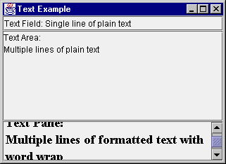
public class TextPanel extends JPanel {
  public TextPanel() {
    // Set the layout to a BorderLayout
    setLayout(new BorderLayout());

    // Create the three basic text components
    JTextField textField = new JTextField();
    JTextArea textArea = new JTextArea();
    JTextPane textPane = new JTextPane();

    //Set the textpane's font properties
    MutableAttributeSet attr =
      new SimpleAttributeSet();
    StyleConstants.setFontFamily(attr, "Serif");
    StyleConstants.setFontSize(attr, 18);
    StyleConstants.setBold(attr, true);
    textPane.setCharacterAttributes(attr, false);

    add(textField, BorderLayout.NORTH);
    add(new JScrollPane(textArea),
      BorderLayout.CENTER);
    add(new JScrollPane(textPane), BorderLayout.SOUTH);
  }
}
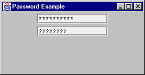
The JPasswordField is a JTextField that
refuses to display its contents openly. By default, the mask
character is the asterisk ('*'). However, you can change this with
the setEchoChar() method. Unlike
java.awt.TextField, an echo character of
(char)0 does not unset the mask.
class PasswordPanel extends JPanel {
  PasswordPanel() {
    JPasswordField pass1 = new JPasswordField(20);
    JPasswordField pass2 = new JPasswordField(20);
    pass2.setEchoChar ('?');
    add(pass1);
    add(pass2);
  }
}
The JEditorPane class is a specialized
JTextComponent for displaying and editing HTML 3.2 tags
or some other format like RTF (rich text format), as determined by
the input. It is not meant to provide a full-fledged browser, but a
lightweight HTML viewer, usually for the purpose of displaying help
text. You either construct the pane with a URL parameter (via a
String or URL), or change pages with the
setPage() method. For HTML content, links within the
HTML page are traversable with the help of a
HyperlinkListener.
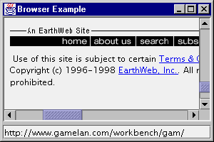
public class Browser extends JPanel {
  Browser() {
    setLayout (new BorderLayout (5, 5));
    final JEditorPane jt = new JEditorPane();
    final JTextField input =
      new JTextField("http://java.sun.com");
    // make read-only
    jt.setEditable(false);
    // follow links
    jt.addHyperlinkListener(new HyperlinkListener () {
      public void hyperlinkUpdate(
          final HyperlinkEvent e) {
        if (e.getEventType() ==
            HyperlinkEvent.EventType.ACTIVATED) {
          SwingUtilities.invokeLater(new Runnable() {
            public void run() {
              // Save original
              Document doc = jt.getDocument();
              try {
                URL url = e.getURL();
                jt.setPage(url);
                input.setText (url.toString());
              } catch (IOException io) {
                JOptionPane.showMessageDialog (
                  Browser.this, "Can't follow link",
                  "Invalid Input",
                   JOptionPane.ERROR_MESSAGE);
                jt.setDocument (doc);
              }
            }
          });
        }
      }
    });
    JScrollPane pane = new JScrollPane();
    pane.setBorder (
      BorderFactory.createLoweredBevelBorder());
    pane.getViewport().add(jt);
    add(pane, BorderLayout.CENTER);

    input.addActionListener (new ActionListener() {
      public void actionPerformed (ActionEvent e) {
        try {
          jt.setPage (input.getText());
        } catch (IOException ex) {
          JOptionPane.showMessageDialog (
            Browser.this, "Invalid URL",
            "Invalid Input",
            JOptionPane.ERROR_MESSAGE);
        }
      }
    });
    add (input, BorderLayout.SOUTH);
  }
}
To activate the hyperlinks within the JEditorPane,
event handling code is provided. Also, if you only want to display
HTML, remember to setEditable(false) to make the editor
read-only.
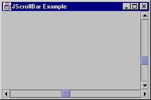
JScrollBar offers a lightweight version of the
java.awt.Scrollbar component.
public class ScrollbarPanel extends JPanel {

  public ScrollbarPanel() {
    setLayout(new BorderLayout());
    JScrollBar scrollBar1 = new JScrollBar (
      JScrollBar.VERTICAL, 0, 5, 0, 100);
    add(scrollBar1, BorderLayout.EAST);
    JScrollBar scrollBar2 = new JScrollBar (
      JScrollBar.HORIZONTAL, 0, 5, 0, 100);
    add(scrollBar2, BorderLayout.SOUTH);
  }
}
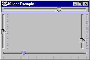
JSlider functions like a JScrollBar;
however, it adds the ability to display major and minor tick marks,
as well as display a Border
around the slider.
public class SliderPanel extends JPanel {
  public SliderPanel() {
    setLayout(new BorderLayout());
    JSlider slider1 =
      new JSlider (JSlider.VERTICAL, 0, 100, 50);
    slider1.setPaintTicks(true);
    slider1.setMajorTickSpacing(10);
    slider1.setMinorTickSpacing(2);
    add(slider1, BorderLayout.EAST);
    JSlider slider2 =
      new JSlider (JSlider.VERTICAL, 0, 100, 50);
    slider2.setPaintTicks(true);
    slider2.setMinorTickSpacing(5);
    add(slider2, BorderLayout.WEST);
    JSlider slider3 =
      new JSlider (JSlider.HORIZONTAL, 0, 100, 50);
    slider3.setPaintTicks(true);
    slider3.setMajorTickSpacing(10);
    add(slider3, BorderLayout.SOUTH);
    JSlider slider4 =
      new JSlider (JSlider.HORIZONTAL, 0, 100, 50);
    slider4.setBorder(
      BorderFactory.createLineBorder(Color.blue));
    add(slider4, BorderLayout.NORTH);
  }
}
In addition to plain tick marks, with JSlider you
can place labels along the axis as either a serious of numbers or
components. For numeric labels, by just calling setPaintLabels
(true), the slider will generate and use a series of labels
based on the major tick spacing. So, if the slider range is 0 to 100
with tick spacing of 10, the slider would then have labels of 0, 10,
20, ... 100. On the other hand, if you want to generate the labels
yourself, you can provide a Hashtable of labels. The
hashtable key would be the Integer value of the
position. The hashtable value would be a Component to
use for display of the label. The following demonstrates both:
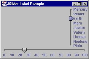
public class SliderPanel2 extends JPanel {
  public SliderPanel2() {
    setLayout(new BorderLayout());
    JSlider right, bottom;
    right = new JSlider(JSlider.VERTICAL, 1, 9, 3);
    Hashtable h = new Hashtable();
    h.put (new Integer (1), new JLabel("Mercury"));
    h.put (new Integer (2), new JLabel("Venus"));
    h.put (new Integer (3), new JLabel("Earth"));
    h.put (new Integer (4), new JLabel("Mars"));
    h.put (new Integer (5), new JLabel("Jupiter"));
    h.put (new Integer (6), new JLabel("Saturn"));
    h.put (new Integer (7), new JLabel("Uranus"));
    h.put (new Integer (8), new JLabel("Neptune"));
    h.put (new Integer (9), new JLabel("Pluto"));
    right.setLabelTable (h);
    right.setPaintLabels (true);
    right.setInverted (true);
    bottom =
      new JSlider(JSlider.HORIZONTAL, 0, 100, 25);
    bottom.setMajorTickSpacing (10);
    bottom.setPaintLabels (true);
    add(right, BorderLayout.EAST);
    add(bottom, BorderLayout.SOUTH);
  }
}
The JProgressBar component allows you to display a
progress bar to reflect the status of an operation. The general
format of using a JProgressBar is as follows:
- Initialize
the
JProgressBar: JProgressBar progressBar = new JProgressBar();
progressBar.setMinimum(0);
progressBar.setMaximum(numberSubOperations);
- Repeat each
time you want to perform an operation:
  progressBar.setValue(progressBar.getMinimum());
  for (int i = 0; i < numberSubOperations; i++) {
    // Perform sub-operation i
    // Update bar value in event thread
    // Where runner is created outside for loop
    SwingUtilities.invokeAndWait(runner);
  }
- Outside the
for-loop, create the
Runnable object Runnable runner = new Runnable() {
public void run() {
int value = progressBar.getValue();
progressBar.setValue(value+1);
}
};
Often, you will want to set up an operation to execute in a
thread and have the operation monitored by a progress bar. This
allows the user to cancel the operation if it is taking too long.
(The ProgressMonitorInputStream class provides this
type of behavior for reading input streams.)
To demonstrate JProgressBar, an example follows. The
stepping thread simply counts up, displaying the current count in a
JTextField. In addition, the bar displays the current
value by setting its stringPainted property to true
with progressBar.setStringPainted(true).
public class ProgressBarPanel extends JPanel {
  Thread loadThread;
  Object lock = new Object();
  boolean shouldStop=false;
  JTextField progressTextField;
  JProgressBar progressBar;
  public ProgressBarPanel() {
    setLayout(new BorderLayout());

    progressTextField = new JTextField();
    add(progressTextField, BorderLayout.NORTH);

    JPanel bottomPanel = new JPanel();
    progressBar = new JProgressBar();
    progressBar.setStringPainted(true);
    bottomPanel.setLayout(new GridLayout(0,1));
    bottomPanel.add(progressBar);
    bottomPanel.add(new JLabel("Load Status"));
    JPanel buttonPanel = new JPanel();
    JButton startButton = new JButton("Start");
    buttonPanel.add(startButton);
    startButton.addActionListener(
        new ActionListener() {
      public void actionPerformed(ActionEvent e) {
        startLoading();
      }
    });
    JButton stopButton = new JButton("Stop");
    buttonPanel.add(stopButton);
    stopButton.addActionListener(
        new ActionListener() {
      public void actionPerformed(ActionEvent e) {
        stopLoading();
      }
    });
    bottomPanel.add(buttonPanel);
    add(bottomPanel, BorderLayout.SOUTH);
  }
  public void startLoading() {
    if(loadThread == null) {
      loadThread = new LoadThread();
      shouldStop = false;
      loadThread.start();
    }
  }
  public void stopLoading() {
    synchronized(lock) {
      shouldStop = true;
      lock.notify();
    }
  }
  class LoadThread extends Thread {
    public void run () {
      int min = 0;
      int max = 100;
      progressBar.setValue(min);
      progressBar.setMinimum(min);
      progressBar.setMaximum(max);
      Runnable runner = new Runnable() {
        public void run() {
          int value = progressBar.getValue();
          value++;
          progressBar.setValue(value);
          progressTextField.setText (""+value);
        }
      };
      for (int i=min;i<=max;i++) {
        try {
          SwingUtilities.invokeAndWait(runner);
        } catch (InvocationTargetException e) {
          break;
        } catch (InterruptedException e) {
            // Ignore Exception
        }
        synchronized(lock) {
          if(shouldStop)
            break;
          try {
            lock.wait(100);
          } catch (InterruptedException e) {
            // Ignore Exception
          }
        }
      }
      loadThread = null;
    }
  }
}
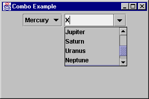
The JComboBox works like AWT's Choice
component, but renames some methods and offers an editable option.
For times when a fixed-list of choices isn't enough, you can offer a
JComboBox with a list of default choices, but still
permit the entry of another value. The nicest part about this
control is that when the user presses the key for the first letter
of an entry, it changes the highlighted selection. You can enhance
this behavior by providing your own
KeySelectionManager, a public inner class of
JComboBox.
public class ComboPanel extends JPanel {
  String choices[] = {
    "Mercury", "Venus", "Earth",
    "Mars", "Jupiter", "Saturn",
    "Uranus","Neptune", "Pluto"};
  public ComboPanel() {
    JComboBox combo1 = new JComboBox();
    JComboBox combo2 = new JComboBox();
    for (int i=0;i<choices.length;i++) {
      combo1.addItem (choices[i]);
      combo2.addItem (choices[i]);
    }
    combo2.setEditable(true);
    combo2.setSelectedItem("X");
    combo2.setMaximumRowCount(4);
    add(combo1);
    add(combo2);
  }
}
There is more to JComboBox than just a few new
methods and editability. Details are included in Part II of this
course, after the Model/View/Controller (MVC) Architecture has been
explained.
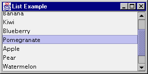
The JList component has both an easy (non-MVC)
implementation and a more complicated view. For the MVC-view, you'll
see an example in Part II of this course with
JComboBox. For now, you'll see how to display a list of
String objects, just like an AWT List
component. Thankfully, it has gotten much easier. To add a
String[] (or Vector) of elements to a
JList, just tell the constructor or use the
setListData() method.
There is one major difference between List and
JList. JList doesn't directly support
scrolling. You need to place the JList within a
JScrollPane object, and let it deal with the scrolling.
public class ListPanel extends JPanel {
  String label [] = {"Cranberry", "Orange",
    "Banana", "Kiwi", "Blueberry",
    "Pomegranate", "Apple", "Pear",
    "Watermelon", "Raspberry", "Snozberry"
  };
  public ListPanel() {
    setLayout (new BorderLayout());
    JList list = new JList(label);
    JScrollPane pane = new JScrollPane(list);
    add(pane, BorderLayout.CENTER);
  }
}
The javax.swing.border package consists of several
objects to draw borders around components. They all implement the
Border interface, which consists of three methods:
public Insets
              getBorderInsets(Component c)
Defines the drawable area
necessary to draw the border
public boolean
              isBorderOpaque()
Defines if the border area is opaque or
transparent
public void
              paintBorder (Component c, Graphics g, int x, int y, int width, int
              height)
Defines how to draw the border within the
specified area. The routine should only draw into the area
requested with getBorderInsets().
The border behavior is defined for JComponent, so
all subclasses inherit the behavior.
Swing provides nine borders, and you can create your own if none
of them meets your needs:
AbstractBorder
- An abstract class that implements the Border
interface, but does nothing
BevelBorder
- A 3D border that may be raised or lowered
CompoundBorder
- A border that can nest multiple borders
EmptyBorder
- A border where you specify the reserved space for an
undrawn border
EtchedBorder
- A border that appears as a groove, instead of raised or
lowered
LineBorder
- A border for single color borders, with arbitrary
thickness
MatteBorder
- A border that permits tiling of an icon or color
SoftBevelBorder
- A 3D border with softened corners
TitledBorder
- A border that permits title strings in arbitrary
locations
You can create a border object directly from the appropriate
class constructor or ask a BorderFactory to create the
border for you, with methods like
createBevelBorder(type) and
createTitledBorder("TItle"). When using
BorderFactory, multiple requests to create the same
border return the same object.
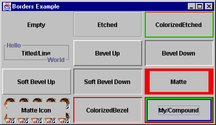
public class BorderPanel extends JPanel {

  class MyBorder implements Border {
    Color color;
    public MyBorder (Color c) {
      color = c;
    }
    public void paintBorder (Component c, Graphics g,
        int x, int y, int width, int height) {
      Insets insets = getBorderInsets(c);
      g.setColor (color);
      g.fillRect (x, y, 2, height);
      g.fillRect (x, y, width, 2);
      g.setColor (color.darker());
      g.fillRect (x+width-insets.right, y, 2, height);
      g.fillRect (x, y+height-insets.bottom, width, 2);
    }
    public boolean isBorderOpaque() {
      return false;
    }
    public Insets getBorderInsets(Component c) {
      return new Insets (2, 2, 2, 2);
    }
  }

  public BorderPanel() {
    setLayout (new GridLayout (4, 3, 5, 5));
    JButton b = new JButton("Empty");
    b.setBorder (new EmptyBorder (1,1,1,1));
    add(b);
    b = new JButton ("Etched");
    b.setBorder (new EtchedBorder ());
    add(b);
    b = new JButton ("ColorizedEtched");
    b.setBorder (new EtchedBorder (Color.red,
                                    Color.green));
    add(b);
    b = new JButton ("Titled/Line");
    b.setBorder(new TitledBorder (
      new TitledBorder(
        LineBorder.createGrayLineBorder(),
        "Hello"),
      "World",
      TitledBorder.RIGHT,
      TitledBorder.BOTTOM));
    add(b);
    b = new JButton ("Bevel Up");
    b.setBorder(new BevelBorder(BevelBorder.RAISED));
    add(b);
    b = new JButton ("Bevel Down");
    b.setBorder(new BevelBorder(BevelBorder.LOWERED));
    add(b);
    b = new JButton ("Soft Bevel Up");
    b.setBorder(
      new SoftBevelBorder(SoftBevelBorder.RAISED));
    add(b);
    b = new JButton ("Soft Bevel Down");
    b.setBorder(
      new SoftBevelBorder(SoftBevelBorder.LOWERED));
    add(b);
    b = new JButton ("Matte");
    b.setBorder(
      new MatteBorder(5, 10, 5, 10, Color.red));
    add(b);
    b = new JButton ("Matte Icon");
    Icon icon = new ImageIcon ("SmallTiger.gif");
    b.setBorder(new MatteBorder(10, 10, 10, 10, icon));
    add(b);

    b = new JButton ("ColorizedBezel");
    b.setBorder(new BevelBorder(BevelBorder.RAISED,
                      Color.red, Color.pink));
    add(b);
    b = new JButton ("My/Compound");
    b.setBorder(new CompoundBorder(
      new MyBorder(Color.red),
      new CompoundBorder (new MyBorder(Color.green),
                          new MyBorder(Color.blue))));
    add(b);
  }
}
You can change the border of any JComponent object
with the setBorder() method.
Magercise
- Using
Borders
The menuing model used in Swing is nearly identical to that used
in AWT. There are three key exceptions:
- The menu
classes (
JMenuItem, JCheckBoxMenuItem,
JMenu, and JMenuBar) are all subclasses
of JComponent. They are not off in their own
independent class hierarchy. As a result of this, you can place a
JMenuBar within any Container, including
Applet. [The JApplet class has a
setJMenuBar() method to add a
JMenuBar.]
- There is a
new menu class,
JRadioButtonMenuItem, to provide a
set of mutually exclusive checkboxes on a menu, when placed within
a ButtonGroup.
- Also, you
can associate an
Icon object with any
JMenuItem.
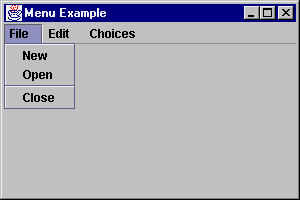
public class MenuTester extends JFrame
implements ActionListener {
public void actionPerformed (ActionEvent e) {
System.out.println (e.getActionCommand());
}
public MenuTester() {
super ("Menu Example");
JMenuBar jmb = new JMenuBar();
JMenu file = new JMenu ("File");
JMenuItem item;
file.add (item = new JMenuItem ("New"));
item.addActionListener (this);
file.add (item = new JMenuItem ("Open"));
item.addActionListener (this);
file.addSeparator();
file.add (item = new JMenuItem ("Close"));
item.addActionListener (this);
jmb.add (file);
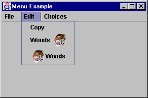
JMenu edit = new JMenu ("Edit");
edit.add (item = new JMenuItem ("Copy"));
item.addActionListener (this);
Icon tigerIcon = new ImageIcon("SmallTiger.gif");
edit.add (item =
new JMenuItem ("Woods", tigerIcon));
item.setHorizontalTextPosition (JMenuItem.LEFT);
item.addActionListener (this);
edit.add (item =
new JMenuItem ("Woods", tigerIcon));
item.addActionListener (this);
jmb.add (edit);
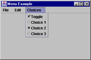
JMenu choice = new JMenu ("Choices");
JCheckBoxMenuItem check =
new JCheckBoxMenuItem ("Toggle");
check.addActionListener (this);
choice.add (check);
ButtonGroup rbg = new ButtonGroup();
JRadioButtonMenuItem rad =
new JRadioButtonMenuItem ("Choice 1");
choice.add (rad);
rbg.add (rad);
rad.addActionListener (this);
rad = new JRadioButtonMenuItem ("Choice 2");
choice.add (rad);
rbg.add (rad);
rad.addActionListener (this);
rad = new JRadioButtonMenuItem ("Choice 3");
choice.add (rad);
rbg.add (rad);
rad.addActionListener (this);
jmb.add (choice);
setJMenuBar (jmb);
}
}
The JSeparator object is the menu separator control.
The image below shows the separator under the File menu from the
example above.
Because Swing menu objects are truly components, you can use
JSeparator outside of menus, too. However, normally you
just add them to a JMenu with
addSeparator().
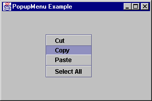
The JPopupMenu component allows you to associate
context-sensitive menus with any JComponent. They work
similarly to the AWT PopupMenu class, with an
addSeparator() method to add a separator bar.
public class PopupPanel extends JPanel {
  JPopupMenu popup = new JPopupMenu ();
  public PopupPanel() {
    JMenuItem item;
    popup.add (item = new JMenuItem ("Cut"));
    popup.add (item = new JMenuItem ("Copy"));
    popup.add (item = new JMenuItem ("Paste"));
    popup.addSeparator();
    popup.add (item = new JMenuItem ("Select All"));
    popup.setInvoker (this);
    addMouseListener (new MouseAdapter() {
      public void mousePressed (MouseEvent e) {
        if (e.isPopupTrigger()) {
          popup.show (e.getComponent(),
            e.getX(), e.getY());
        }
      }
      public void mouseReleased (MouseEvent e) {
        if (e.isPopupTrigger()) {
          popup.show (e.getComponent(),
            e.getX(), e.getY());
        }
      }
    });
  }
}
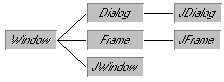
The Window class hierarchy is a little different
when the Swing window classes are added.
As the diagram shows, they all subclass Window, not
JComponent. This means they are not
lightweight, have a peer, and cannot be transparent.
The JFrame class is the replacement for AWT's
Frame class. In addition to the ability to add a
java.awt.MenuBar via setMenuBar(), you can
add a JMenuBar to a JFrame via
setJMenuBar().
The other difference of the JFrame class is shared
with the JWindow and JDialog classes. No
longer do you just add() components to each directly or
setLayout() to change the LayoutManager.
Now, you must get what's called a content pane, then add
components to that or change its layout.
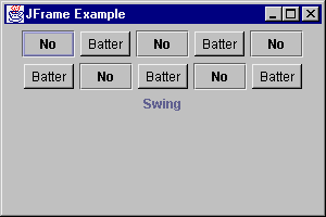
public class FrameTester {
  public static void main (String args[]) {
    JFrame f = new JFrame ("JFrame Example");
    Container c = f.getContentPane();
    c.setLayout (new FlowLayout());
    for (int i = 0; i < 5; i++) {
      c.add (new JButton ("No"));
      c.add (new Button ("Batter"));
    }
    c.add (new JLabel ("Swing"));
    f.setSize (300, 200);
    f.show();
  }
}
The reason you have to get a content pane is because the inside
of a window is now composed of a JRootPane, which no
longer shields you from the inner workings of the
Window, as AWT did.
One other difference between JFrame and
Frame is JFrame has a property that
defines the default close operation. With Frame,
nothing happens, by default, if you try to close the frame. On the
other hand, JFrame will hide itself when you try to
close it. The setDefaultCloseOperation() method lets
you define three operations that can happen when the user tries to
close a JFrame:
DO_NOTHING_ON_CLOSE:
The AWT Frame behavior
HIDE_ON_CLOSE:
The default behavior. When user tries to close the window, the
window will be hidden. You can then setVisible(true)
to reshow it.
DISPOSE_ON_CLOSE:
When user tries to close window, it will be disposed.
Both HIDE_ON_CLOSE and DISPOSE_ON_CLOSE
perform their operations last, in case an event listener needs to
use the information from the closing event.
A JRootPane is a container that consists of two
objects, a glass pane and a layered pane. The glass pane is
initially invisible, so all you see is the layered pane. The layered
pane also consists of two objects, an optional menu bar and a
content pane. You work with the content pane just like you would the
inside of a Window, Dialog, or
Frame in AWT. The way the glass pane works is if you
place a component in it, this component will always display in front
of the content pane. This allows things like popup menus and tool
tip text to work properly. The layering effect is done with the help
of the new JLayeredPane component, explained next.
Normally, the only difference in coding is changing all lines
like:
aFrame.setLayout (new FlowLayout());
aFrame.add(aComponent);
to new lines accessing the content pane:
aFrame.getContentPane().setLayout (new FlowLayout());
aFrame.getContentPane().add(aComponent);
The rest of the panes are accessed with similar methods, though
are rarely accessed directly. The layout management of all these
panes is done through a custom layout manager.
  Container getContentPane();
  setContentPane (Container);
  Component getGlassPane();
  setGlassPane (Component);
  JLayeredPane getLayeredPane();
  setLayeredPane (JLayeredPane);
  JMenuBar getMenuBar();
  setMenuBar (JMenuBar);
The JLayeredPane container keeps its children in
layers to define an order to paint its components. When you add a
component to the pane, you specify which layer you want it in:
layeredPane.add (component, new Integer(5));
The default layer is the value
JLayeredPane.DEFAULT_LAYER. You can add or subtract
values from this value to have things appear above or below,
layerwise. The LayoutManager of the pane determines
what happens with the layers. Using FlowLayout or
GridLayout as the layout only reorders the components
as they are added; they will not be drawn on top of each other. For
an example of actually drawing overlaid components, see the
examples subdirectory that comes with the Swing
release.
For applets to properly handle the Swing component set, your
applets need to subclass JApplet instead of
Applet. JApplet is a special subclass of
Applet that adds support for JMenuBar and
handles the painting support required by Swing child components
(along with any other necessary tasks like accessibility support).
Also, like JFrame, JApplet has a
JContentPane to add components into, instead of
directly to the applet. Another difference is the default
LayoutManager: in JApplet it is
BorderLayout, while in Applet it has
always been FlowLayout.
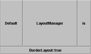
public class AppTester extends JApplet {
  public void init () {
    Container c = getContentPane();
    JButton jb = new JButton ("Default");
    c.add (jb, BorderLayout.WEST);
    jb = new JButton ("LayoutManager");
    c.add (jb, BorderLayout.CENTER);
    jb = new JButton ("is");
    c.add (jb, BorderLayout.EAST);
    jb = new JButton ("BorderLayout: " +
      (c.getLayout() instanceof BorderLayout));
    c.add (jb, BorderLayout.SOUTH);
  }
}
The LayoutManager is actually a custom subclass of
BorderLayout. This subclassing ensures that when a
component with no constraints is added, the subclass maps the
component to the CENTER area.
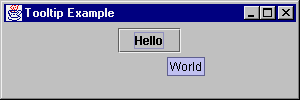
A tooltip is a context-sensitive text string that is
displayed in a popup window when the mouse rests over a particular
object on the screen. Swing provides the JToolTip class
to support this; however, you will rarely use it directly. To create
a tooltip, you only need to call the setToolTipText()
method of JComponent.
public class TooltipPanel extends JPanel {
  public TooltipPanel() {
    JButton myButton = new JButton("Hello");
    myButton.setToolTipText ("World");
    add(myButton);
  }
}
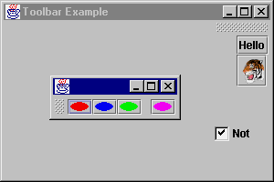
The JToolBar control offers a container that
displays its components in a toolbar fashion, across or down, in one
row or column, depending upon the area of the screen it is placed
in. Certain user-interface models permit floatable
toolbars; the default user-interface is one that supports floating.
In order to disable the floatable capability, just call the
setFloatable() method. It is possible that a particular
user interface may ignore this setting.
// Disabling floating
aToolBar.setFloatable (false);
When JToolBar is considered floatable, this means a
user can drag it to another area of the screen, or place it in a
window external from the original container.
To demonstrate a JToolBar, take a look at the
following example. As it demonstrates, there are no restrictions on
what components appear within the toolbar. However, it works best if
they are all the same type and size.
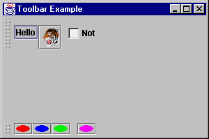
public class ToolbarPanel extends JPanel {
  ToolbarPanel() {
    setLayout (new BorderLayout());
    JToolBar toolbar = new JToolBar();
    JButton myButton = new JButton("Hello");
    toolbar.add(myButton);
    Icon tigerIcon = new ImageIcon("SmallTiger.gif");
    myButton = new JButton(tigerIcon);
    toolbar.add(myButton);
    toolbar.addSeparator();
    toolbar.add (new Checkbox ("Not"));
    add (toolbar, BorderLayout.NORTH);
    toolbar = new JToolBar();
    Icon icon = new AnOvalIcon(Color.red);
    myButton = new JButton(icon);
    toolbar.add(myButton);
    icon = new AnOvalIcon(Color.blue);
    myButton = new JButton(icon);
    toolbar.add(myButton);
    icon = new AnOvalIcon(Color.green);
    myButton = new JButton(icon);
    toolbar.add(myButton);
    toolbar.addSeparator();
    icon = new AnOvalIcon(Color.magenta);
    myButton = new JButton(icon);
    toolbar.add(myButton);
    add (toolbar, BorderLayout.SOUTH);
  }
  class AnOvalIcon implements Icon {
    Color color;
    public AnOvalIcon (Color c) {
      color = c;
    }
    public void paintIcon (Component c, Graphics g,
                          int x, int y) {
      g.setColor(color);
      g.fillOval (
        x, y, getIconWidth(), getIconHeight());
    }
    public int getIconWidth() {
      return 20;
    }
    public int getIconHeight() {
      return 10;
    }
  }
}
After dragging around the toolbar, the user may just leave it
looking a little different than you originally planned:
Magercise
- Using
Menus, Toolbars, and Tool Tips
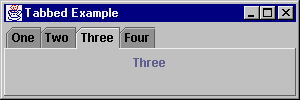
The JTabbedPane component offers a tabbed control
for quick accessibility to multiple panels. If you ever tried to use
CardLayout in JDK 1.0/1.1, you'll appreciate this:
JTabbedPane adds the necessary support for changing
from one card to the next. After creating the control, you add cards
to it with the addTab() method. There are three forms
for the addTab() method. One offers a quick way to
associate a JToolTip to a tab, while the others only
permit text, an Icon, or both. Any
Component subclass can be the object added to each
card.
addTab(String
              title, Component component)
- Create new tab with
title as tab label and component shown within
tab when selected.
addTab(String
              title, Icon icon, Component component)
- Adds an options
icon to be associated with the title for the
tab. Either may be null.
addTab(String
              title, Icon icon, Component component, String tip)
- Adds
tip as the tooltip for the tab.
public class TabbedPanel extends JPanel {
  String tabs[] = {"One", "Two", "Three", "Four"};
  public JTabbedPane tabbedPane = new JTabbedPane();
  public TabbedPanel() {
    setLayout (new BorderLayout());
    for (int i=0;i<tabs.length;i++)
      tabbedPane.addTab (tabs[i], null,
                         createPane (tabs[i]));
    tabbedPane.setSelectedIndex(0);
    add (tabbedPane, BorderLayout.CENTER);
  }
  JPanel createPane(String s) {
    JPanel p = new JPanel();
    p.add(new JLabel(s));
    return p;
  }
}
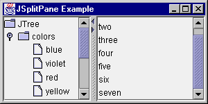
The JSplitPane control offers user-controlled
resizing of two components within a container.
You can place a JSplitPane within a
JSplitPane for control of more then two components,
and, you can control whether the splitting happens vertically or
horizontally.
The setContinuousLayout property causes each pane to
be updated continuously as the splitter is dragged, when set to
true.
You can move the divider programmatically by setting the
dividerLocation property to a floating point value
between 0.0 and 1.0 to indicate a percentage of the screen or to an
integer value for an absolute position.
The following screenshots demonstrate a JSplitPane
between a JTree and a JList. (Note that
the scrollbars in the pictures are there because the components are
included in a JScrollPane; it is not a result of the
JSplitPane.
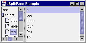
The arrows on the splitter bar are obtained by setting the
oneTouchExpandable property of the
JSplitPane to true. Pressing them will
fully push the splitter in the direction of the arrow, or return it
to its previous position.
Note that the splitter bar will not move past the
minimumSize of either component if it can avoid it. In
many cases it is desirable to call the following:
comp.setMinimumSize(new Dimension(0,0));
on each component to allow full movement of the splitter bar.
public class JSplitPanel extends JPanel {

  public JSplitPanel() {
    setLayout(new BorderLayout());
    JTree tree = new JTree();
    String[] items = {"a", "two", "three",
      "four", "five", "six", "seven"};
    JList list = new JList(items);
    JScrollPane left = new JScrollPane(tree);
    JScrollPane right = new JScrollPane(list);
    left.setMinimumSize(new Dimension(0,0));
    right.setMinimumSize(new Dimension(0,0));
    JSplitPane pane = new JSplitPane(
      JSplitPane.HORIZONTAL_SPLIT, left, right);
    pane.setDividerLocation(0.5);
    pane.setOneTouchExpandable(true);
    add(pane, BorderLayout.CENTER);
  }
}
There are four primary Swing layout managers, two are built into
components (ScrollPaneLayout and
ViewportLayout) and the remaining two
(BoxLayout and OverlayLayout) are used
like the ones from java.awt. The BoxLayout
also happens to be built into the Box component.
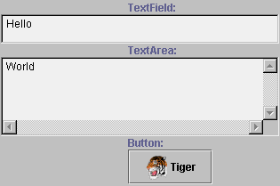
The BoxLayout layout manager allows you to arrange
components along either an x-axis or y-axis. For instance, in a
y-axis BoxLayout, components are arranged from top to
bottom in the order in which they are added.
Unlike GridLayout, BoxLayout allows
components to occupy different amounts of space along the primary
axis. A JTextField in a top-to-bottom
BoxLayout can take much less space than a
JTextArea.
Along the non-primary axis, BoxLayout attempts to
make all components as tall as the tallest component (for
left-to-right BoxLayouts) or as wide as the widest
component (for top-to-bottom BoxLayouts). If a
component cannot increase to this size, BoxLayout looks
at its Y-alignment property or X-alignment property to determine how
to place it within the available space. By default,
JComponent objects inherit an alignment of 0.5
indicating that they will be centered. You can override the
getAlignmentX() and getAlignmentY()
methods of Container to specify a different default
alignment. JButton for instance specifies left
alignment.
To create a BoxLayout, you must specify two
parameters:
setLayout(new BoxLayout(this, BoxLayout.Y_AXIS));
The first parameter specifies the container and the second the
major axis of the BoxLayout. Components can then be
added as they are in a GridLayout or
FlowLayout:
add(myComponent);
class BoxLayoutTest extends JPanel {

  BoxLayoutTest() {
    // Set the layout to a y-axis BoxLayout
    setLayout(new BoxLayout(this, BoxLayout.Y_AXIS));

    // Create three components
    TextField textField = new TextField();
    TextArea textArea = new TextArea(4, 20);
    JButton button = new JButton(
      "Tiger", new ImageIcon("SmallTiger.gif"));

    // Add the three components to the BoxLayout
    add(new JLabel("TextField:"));
    add(textField);
    add(new JLabel("TextArea:"));
    add(textArea);
    add(new JLabel("Button:"));
    add(button);
  }}
The Box class is a convenience container whose
default layout manager is a BoxLayout. Rather than
subclassing JPanel as above, the previous example could
have subclassed the Box class. In addition to being a
BoxLayout container, Box has some very
useful static methods for arranging components in a
BoxLayout. These methods create non-visual components
that act as fillers and spacers.
createVerticalStrut(int) |
Returns
a fixed height component used for spacing |
createHorizontalStrut(int) |
Returns
a fixed width component used for spacing |
createVerticalGlue() |
Returns
a component whose height expands to absorb excess space
between components |
createHorizontalGlue() |
Returns
a component whose width expands to absorb excess space between
components |
createGlue() |
Returns
a component whose height will expand for a y-axis box and
whose width will expand for an x-axis Box |
createRigidArea(Dimension) |
Returns
a fixed height, fixed width component used for
spacing |
Now, rather than using labels to space components out as above,
you could use struts and glue:
public class TestBox extends Box {
  TestBox() {
    super(BoxLayout.Y_AXIS);

    // Create the three basic text components
    TextField textField = new TextField();
    TextArea textArea = new TextArea(4, 20);
    JButton button = new JButton("Tiger", new
      ImageIcon("SmallTiger.gif"));

    // Separate the three components
    // by struts for spacing
    add(createVerticalStrut(8));
    add(textField);
    add(createVerticalGlue());
    add(textArea);
    add(createVerticalGlue());
    add(button);
    add(createVerticalStrut(8));
  }
}
The struts will appear as top and bottom margins and the glue
will expand to fill space when the Box is heightened.
Magercise
- Using
BoxLayout
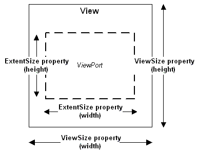
The ScrollPaneLayout is the layout manager used by a
JScrollPane. You do not need to create one, nor
associate it to the JScrollPane. That is done for you
automatically. The layout defines nine different areas for the
JScrollPane:
- one
JViewport - in the center for the content
- two
JScrollBar objects - one each for horizontal and
vertical scrolling
- two
JViewport objects - one for a column headers, the
other row
- four
Component objects - one for each of the
corners
The JScrollPane constants to specify the
corners are: LOWER_LEFT_CORNER,
LOWER_RIGHT_CORNER, UPPER_LEFT_CORNER,
UPPER_RIGHT_CORNER.
The center viewport portion of this layout is of primary interest
for simple layouts. A JViewport is itself a container
object that can hold components. This allows for some very flexible
arrangements. JViewport contains its own layout
manager, ViewportLayout.
ViewportLayout is the layout manager used by a
JViewport. You should never need to use the layout
directly, as it is automatically associated with a
JViewport object, and positions the internal component
for you based upon the JViewport properties.
While this may seem like quite a bit for Swing, there is much
more to see, do, and learn. To follow the latest Swing-related
happenings, be sure to visit Sun's online technical resource The Swing
Connection. Certain topics you should be sure not to miss:
Copyright © 1998-1999 MageLang
Institute. All Rights Reserved.

 Requires login